CRM Mobile Optimization
Overview
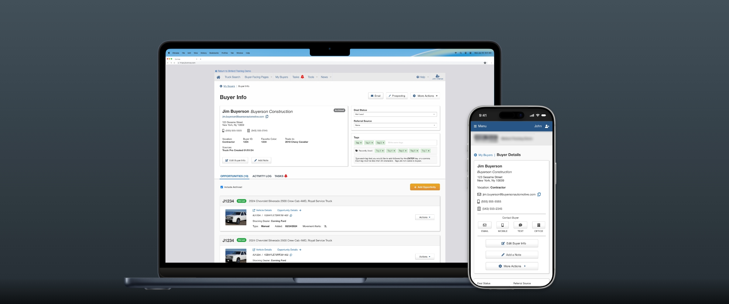
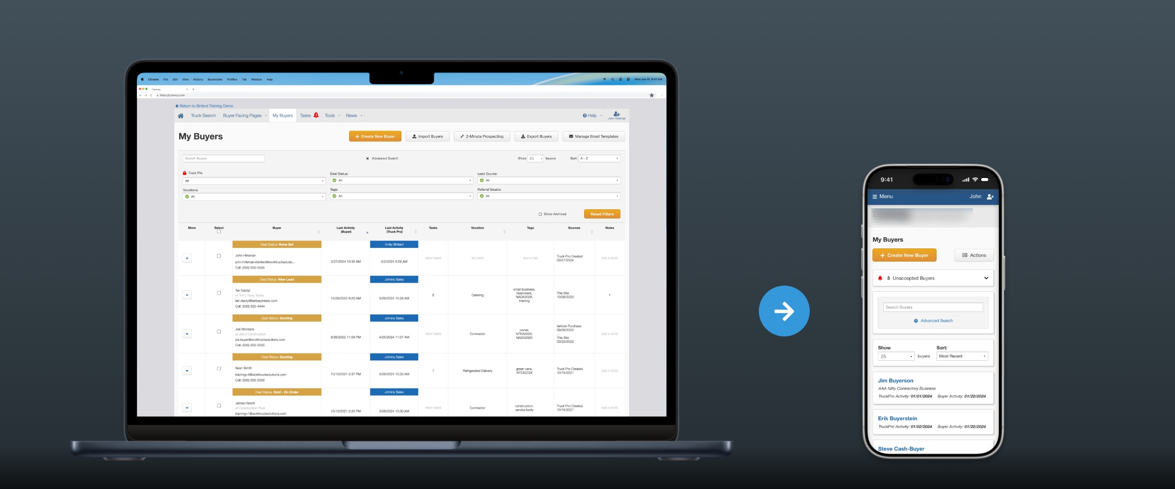
Sales reps at commercial vehicle dealerships relied on a CRM system to track buyers, manage leads, and stay on top of deal activity. But the platform was built for desktop, and the reality of dealership work happens on the lot, on the road, and away from a desk. When reps tried to check deal status or respond to buyer updates on their phones, they hit walls — data-heavy tables that were nearly unusable on mobile, and a single-screen layout built around dialog windows that couldn't scale to the richer experience users needed.
Taking large data tables down to a mobile canvas.
This project was a full redesign of the mobile experience, rethinking navigation, simplifying complex data displays, and building a design system from the ground up to establish consistency across the platform. The result was a linear, mobile-optimized interface that put the most critical actions front and center, and a design system that became the gold standard for the rest of the product suite.
Problem
Sales reps at commercial vehicle dealerships needed mobile access to their CRM but the desktop-first design made critical tasks (checking deal status, reviewing buyer communications) frustrating on phones. Data-heavy tables and dialog-based navigation didn't translate to small screens.
Process
Started with stakeholder interviews (sales managers), mapped user journeys for new and existing buyer interactions, identified need for linear navigation vs. single-page dialogs. Solved table complexity with card components, added notification badges for communication types, elevated high-value actions. Built design system documentation during hi-fi phase to establish consistency. Validated wireframes with internal sales team, iterated based on feedback to restore necessary features.
Solution
Linear navigation structure (search → buyer details), card-based layout replacing tables, dedicated buyer detail pages with tabbed sections for opportunities and activity, prominent CTAs for key actions (status changes, messaging), icon system for communication types, comprehensive design system establishing component standards and usage guidelines.
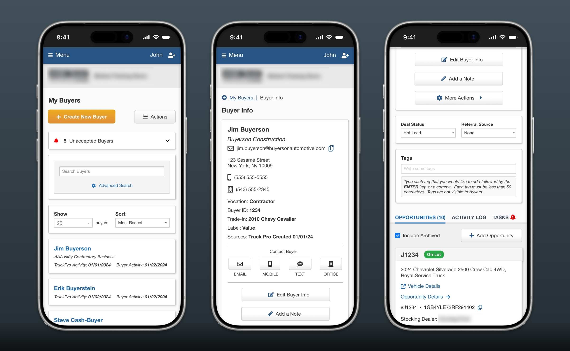
The redesigned mobile experience converted complex tables to card components.
Outcome
Positive beta tester and stakeholder feedback, measurable increase in mobile usage via analytics, design system became foundation for platform-wide modernization effort (migration to new tech stack). This project demonstrated the value of incremental improvement over radical redesign when balancing user needs with organizational readiness.
Personal Learning
Importance of transparent communication and documentation, balancing innovation with change management, understanding when to propose future enhancements vs. current-phase work.