Comvoy: From Inherited Constraints to Strategic Redesign
Overview
Over six years as principal designer of a national commercial vehicle marketplace, I navigated the tension between rapid launch constraints and long-term user experience vision. The platform launched quickly by inheriting architecture from existing dealer tools, but that speed came with technical debt — exhaustive filters with poor hierarchy, cramped layouts, and off-brand visual identity. Leadership resistance to change meant every improvement required hard data to justify.
Through incremental, validated changes — mobile optimization improving page load scores by 65%, A/B testing that removed friction points, strategic filter reorganization based on usage analytics — I built the case for comprehensive modernization. When new leadership finally opened the door to redesign, I proposed a bold visual direction and simplified user experience. Within five months of my departure, 75% of those recommendations were implemented on the live site, validating the design vision I'd advocated for throughout my tenure.
Building Comvoy from the Ground Up (2019-2025)
Comvoy is a national marketplace for commercial work trucks connecting dealers across the country with individual buyers and fleet managers. As the principal designer from inception through 2025, I was responsible for establishing the visual identity, navigation structure, and user experience working directly with the CEO. The platform launched quickly by leveraging existing SaaS architecture for the vehicle search page (VSP) and vehicle detail page (VDP), which allowed rapid deployment but carried technical limitations and outdated UX patterns not optimized for a large national marketplace.
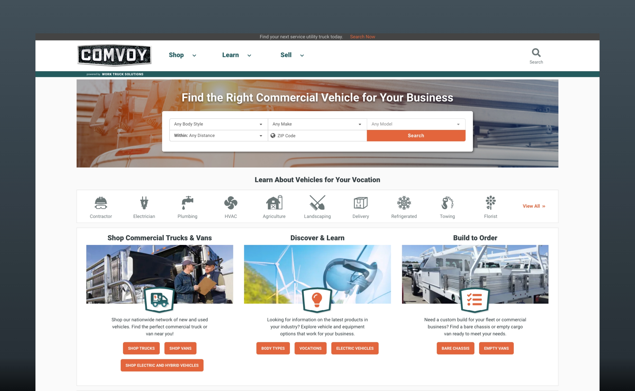
Comvoy's homepage design aesthetics prior to 2025. It featured more content driven focus like articles and exposition for vocations and lacked buyer engagement.
The Challenge
The inherited architecture presented significant constraints. The VSP featured an exhaustive, poorly organized filter sidebar listing every search category with raw data rather than strategic hierarchy. Vehicle cards displayed in list style with two small images instead of a modern card layout. The VDP used a cramped three-column layout that created visual strain and buried important information. The color scheme (racing orange and teal) felt off-brand for the work truck demographic. Primary CTAs like "I'm interested" tested poorly compared to alternatives. Leadership resistance to change slowed evolution, prioritizing dealer-focused content features (dealership directory, "best in show" galleries) over buyer experience improvements, despite advocacy from both design and product teams.
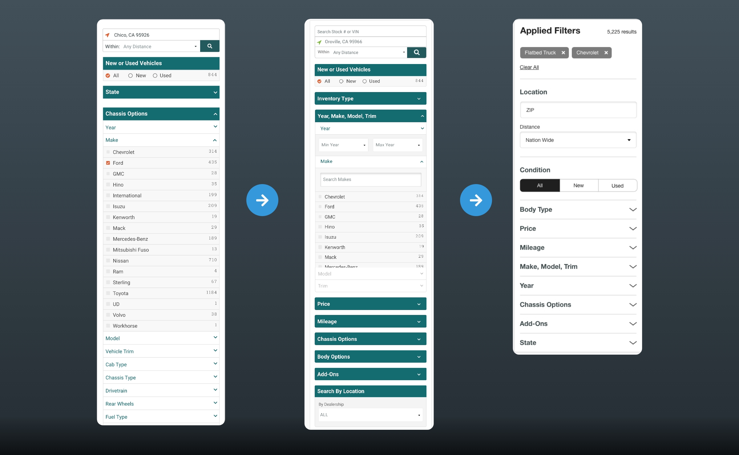
The refined evolution of Comvoy filters sidebar.
Progress Witin Constraints
Over six years, I led incremental improvements validated through data. Working closely with product management to identify performance issues, mobile optimization efforts increased page load scores from 40% to 65% improvement in LCP and CLS metrics. Their collaboration in advocating for these technical improvements was instrumental to gaining leadership buy-in. A/B testing proved the vehicle carousel could be removed with no negative impact on conversions while improving load times. Mobile filter refinements and contextual UX features improved mobile retention by 5% (mobile represented 70% of traffic). Multivariate tests showed "Check availability" CTA performed 0.8% better than "I'm interested." Google Analytics data revealed the most frequently used search filters, which informed strategic filter reorganization. Competitive analysis of other marketplaces and ecommerce platforms provided patterns for presenting those priority filters, particularly on mobile where a minimized list showcased top-used options with "View all" for refined search.
The Proposed Redesign
New product leadership opened the door to comprehensive modernization. The redesign philosophy centered on vehicle-first presentation and bold, professional visual identity reflecting the work truck industry. Color scheme shifted from orange/teal to dark slate gray, black, white, and orange - grounded, modern, confident.
VSP redesign proposed card-based layout (three per row on desktop) with single large vehicle image, carousel gallery, streamlined attributes, clear pricing, location, and "Check availability" CTA. Filter sidebar simplified through nested categories with overflow scrolling, reducing overall height. Mobile filters showed minimized top-used options with "View all" for refined search.
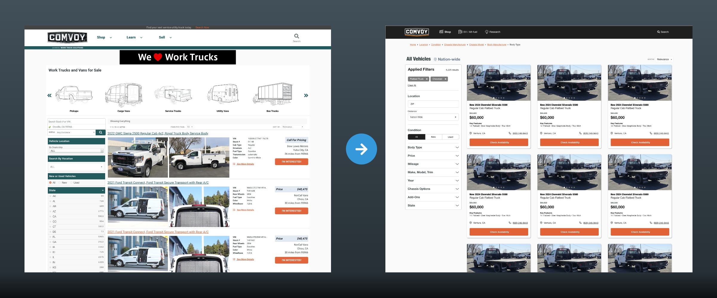
The legacy version of the Comvoy vehicle search page compared to my proposal.
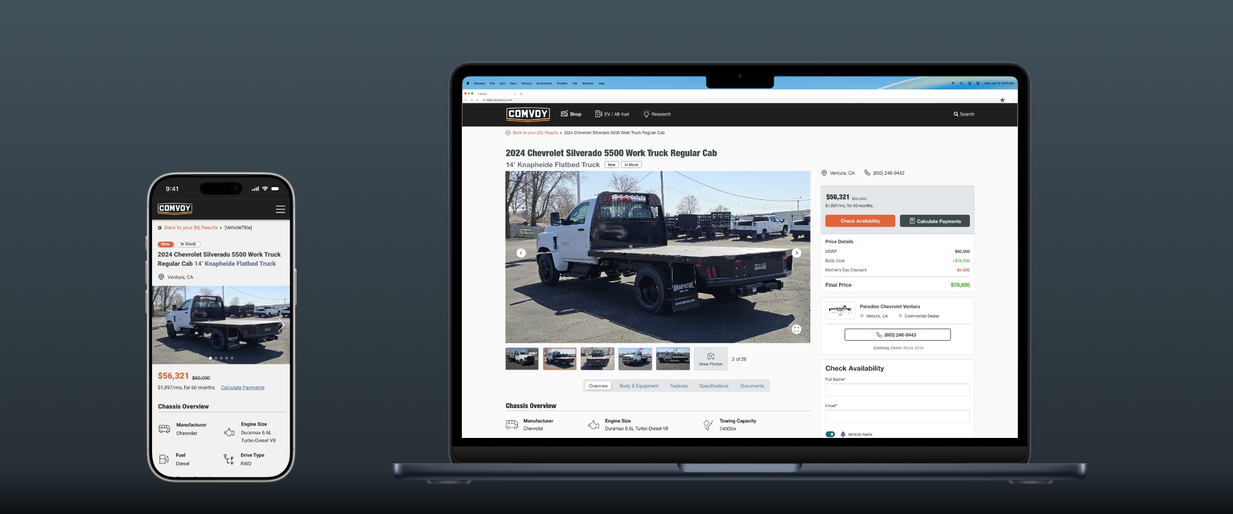
VDP redesign emphasized vehicle images and attributes in a 2/3 layout with larger image gallery, refined specifications display, and reduced visual strain from the old three-column tables. Pricing, rebates, and lead form occupied the remaining third. This VDP redesign has not yet been fully adopted by the current team.
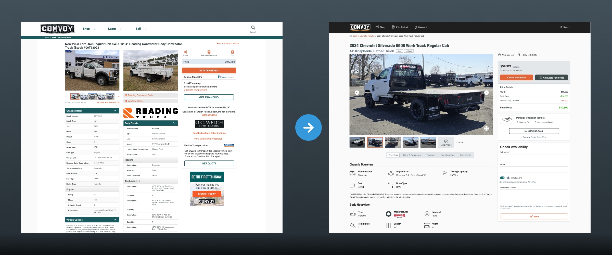
The legacy version of the Comvoy vehicle details page compared to my proposal.
Navigation simplified the mega menu from multiple columns and ads to focused body types, popular brands, and upfit manufacturers.
Outcome
Approximately 75% of proposed recommendations were implemented within five months of departure, including VSP card layout, filter organization, mobile optimization, navigation simplification, and color scheme modernization. The validation of this design vision by new leadership confirmed the strategic direction advocated through data over six years.
Personal Learning
As the sole digital UX/UI designer across multiple company initiatives with limited development resources, strategic prioritization and data-driven advocacy were essential to move the needle on a flagship product resistant to change. Small, validated improvements compound over time.